CLAIM
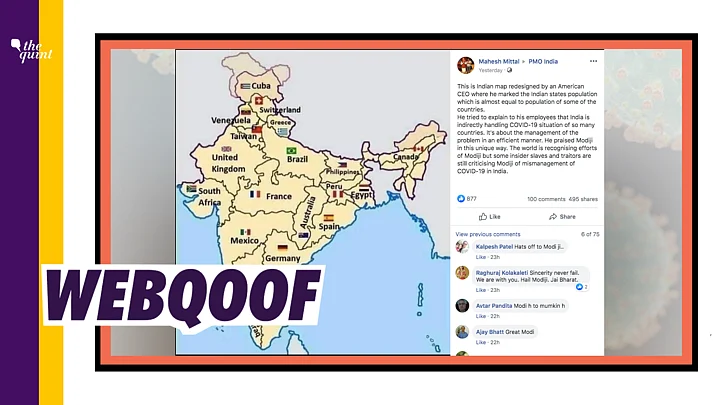
A ‘re-designed’ map of India showing its states as countries of the world in accordance with their population has been going viral on social media with the claim that this has been designed by an American CEO to show how India is indirectly combatting the COVID-19 situation of many countries. The message then goes on to say how Modi’s handling of the crisis is much appreciated.
The viral message reads thus: “This is Indian map redesigned by an American CEO where he marked the Indian states population which is almost equal to population of some of the countries. He tried to explain to his employees that India is indirectly handling COVID-19 situation of so many countries. It's about the management of the problem in an efficient manner. He praised Modiji in this unique way. The world is recognising efforts of Modiji but some insider slaves and traitors are still criticising Modiji of mismanagement of COVID-19 in India. (sic)”
The photo, along with the same message, was viral on Facebook.
Rohit Kumar Singh, Additional Chief Secretary Department of Medical Health & Family Welfare, Government of Rajasthan also shared the photo along with the message on 14 April.
BJP National General Secretary Ram Madhav also tweeted the same photo with the message on the map.
However, it may be noted that he has since retweeted news article fact-checking this claim.
Many other users also shared the same post on Twitter.
TRUE OR FALSE?
While the map exists, it is old and has nothing to do with the current outbreak of coronavirus and PM Modi’s handling of the situation. It was made simply as a population comparison four years ago.
WHAT WE FOUND
On performing a reverse search on the photo, we found tweets from April 2016 with the same map.
Norwegian diplomat and former politician Erik Solheim had shared the photo on 29 April 2016 to remark about India’s population.
In one of the comments on his tweet, he had also explained that the comparison was on the basis of population and not land size.
Amit Ranjan, co-founder of SlideShare had also shared the photo on 13 April 2016.
Therefore, it is clear that while map shows mapping according to population, it is firstly old and has no coronavirus context. It is being shared falsely with that context now, to praise PM Modi’s handling of the situation and claim that his efforts are being recognised worldwide.
You can read all our fact-checked stories here.
(With inputs from SM HoaxSlayer)
(Not convinced of a post or information you came across online and want it verified? Send us the details on WhatsApp at 9643651818, or e-mail it to us at webqoof@thequint.com and we'll fact-check it for you. You can also read all our fact-checked stories here.)
(At The Quint, we question everything. Play an active role in shaping our journalism by becoming a member today.)
